Last updated:
Statistical Process Control (SPC) is a method that uses statistical techniques to monitor and control a manufacturing process.
I used to assume that if you set a machine up perfectly, it should produce perfect parts indefinitely. If a dimension drifted, I would immediately tweak the settings to fix it. But it turns out, that helps absolutely nobody.
By constantly tweaking a machine based on every single measurement, you are often just amplifying the problem.
I realized that every process, no matter how precise, has a heartbeat (a natural rhythm of variation). To manage this without going crazy, we need Statistical Process Control (SPC).
Its goal is to tell you when you are actually off course versus when you are just hitting a small bump in the road.
The goal is straightforward: Efficiency.
By using SPC, you can ensure your process operates at its maximum potential, producing more specification conforming products and creating significantly less waste.
You stop relying on expensive end of line inspection and start preventing errors before they happen.
You might hear this term used interchangeably with Statistical Quality Control (SQC), or see it referenced in broader guides on Quality Control.
While they share DNA, SPC focuses heavily on the inputs and the active process rather than just the final output.
In this post, I’d like to help you build a solid mental model for SPC. We are going to cover:
- The history of how these tools moved from munitions factories to modern labs.
- The critical difference between “Common Cause” and “Special Cause” variation.
- How to use Control Charts (without needing a PhD in math).
- How to implement these strategies in your own workflow.
I promise, it is easier than it looks.
Table of Contents
What is Statistical Process Control?
Most people think of quality assurance like a final exam. You manufacture the product, then you inspect it at the very end of the line.
If it fails, you scrap it.
But frankly, that is an incredibly expensive way to do business. By the time you find the defect, the time and materials are already wasted.
Statistical Process Control (SPC) flips this model on its head.
Instead of waiting for the finished product, we use statistical methods to monitor the production process in real time. The goal is to move from detection (finding bad parts) to prevention (stopping them from being made in the first place).
It’s a lot like baking cookies.
Traditional inspection is tasting a cookie after it comes out of the oven to see if it’s burnt. SPC is watching the oven temperature and timer while they bake. If the temperature spikes, you fix it before the batch is ruined.
There is a tricky distinction between SPC and Statistical Quality Control (SQC). While SQC monitors process outputs (dependent variables) and includes acceptance sampling, SPC focuses on controlling the process inputs (independent variables). SPC does not use acceptance sampling directly.
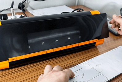
To make this work, we rely on rigorous quality data.
We gather this from direct product measurements and instrumentation readings. By analyzing this data statistically, we ensure the process behaves consistently, saving us from the headache of post-production correction.
History of SPC
It helps to know where this stuff actually comes from to really get the “why” behind it.
The story starts back in the early 1920s with a physicist named Walter A. Shewhart at Bell Laboratories.
He was trying to solve a tricky problem: distinguishing between random noise and actual problems in telephone equipment manufacturing.
In 1924, Shewhart wrote a memo that included the very first sketch of a control chart. This was the birth of the concept of statistical control.
He realized that you can’t just react to every little variation.
You need a way to see the signal through the noise.
During World War II, the stakes got much higher. The US military needed to ensure the quality of munitions and weapons without checking every single bullet.
They adopted Shewhart’s control charts massively to keep production safe and reliable.
After the war, professionals formed the American Society for Quality Control in 1945 to keep the momentum going. But oddly enough, American industry largely drifted away from these methods.
That is where W. Edwards Deming steps in.
He took these concepts to Japan, where they were embraced enthusiastically. By the 1970s, Japanese products were dominating global markets with superior quality.
This competitive pressure forced American manufacturers to rediscover SPC, bringing it back as a standard for modern quality assurance.
What is a Common Cause Variation?
Tricky part about analyzing process data is: perfect consistency is a myth.
You might expect your production line to hit the exact same number every time, but in reality, every process has a natural background of fluctuation.
We call this Common Cause Variation.
Think of it like the slight vibration of a car engine while it’s idling. It is intrinsic to the system and creates a predictable pattern of noise.
We often refer to these as non assignable or normal sources of variation because you cannot pinpoint a single external error causing them.
They are just part of how the current process works.
When your data shows only common causes, we say the process is in statistical control.
It produces a stable, repeatable distribution over time. It creates a reliable heartbeat that you can predict, even if it isn’t perfectly flat.
Examples of Common Causes
It helps to visualize what these normal vibrations look like. These represent the standard operating conditions of your facility:
- Material Properties: Slight variances in tensile strength within the supplier’s specification.
- Environment: The predictable shift in shop floor humidity or temperature from morning to afternoon.
- Tool Wear: The slow, normal degradation of a drill bit or cutting tool over its lifespan.
- Operator Variance: Tiny differences in how operators manually dial in settings.
- Measurement System: The inherent uncertainty or “noise” in your calipers or CMM probes.
It’s just a set of many other potential exemples.
What is a Special Cause Variation?
If common cause variation is the gentle, background “hum” of your machine, special cause variation is a loud “clank”.
It represents variation from external sources that aren’t part of the standard process loop. In the statistics world, we often call these assignable sources because, unlike general noise, you can usually point a finger at exactly what went wrong.
Problem is,
While common causes affect every single item you produce, special causes are sneaky. They usually affect only some of the process output and tend to be intermittent and unpredictable.
You might see a run of perfect parts, and then suddenly, everything goes crazy.
When you spot this pattern on your control charts (typically when a data point jumps outside the upper control limit or lower control limit), it indicates the process is out of statistical control.
The good news?
Special causes are actually easier to fix than common causes. Once you identify and eliminate that specific gremlin, your process returns to a “stable” state.
You just need to identify it fast, because when it happens, it usually generate a lot of troubles.
Examples
These clanks are distinct, assignable events that disrupt the flow. Some classic examples :
- A specific machine controller failing unexpectedly.
- An operator continuously making improper equipment adjustments.
- A sudden shift in the measurement system (like using a gauge that was dropped).
- A bad batch of raw material that has properties outside design specifications.
- A physical breakage, such as a snapped drill bit or a chipped punch.
- A new, inexperienced operator taking over a shift without proper training.
As you see, it has a very (very) wide range of cause.
What are Control Charts?
If you want to visualize your manufacturing process, you need a control chart.
Following the history of SPC, this tool remains the absolute bread and butter of the methodology. It allows us to monitor process variation over time and, it helps us distinguish between the random background noise (common cause variation) and actual, fixable problems (special cause variation).
Think of a control chart like the lane keeping assist in a modern car. It knows the difference between you gently drifting within your lane and you actually swerving off the road.
Every control chart is built on three main components:
- Center Line (CL): This represents the average, or the in-control mean of your process data.
- Upper Control Limit (UCL): The maximum value expected from the process.
- Lower Control Limit (LCL): The minimum value expected from the process.
We usually define these limits using the Three Sigma Rule.
We take the mean (μ) and add or subtract three standard deviations (σ).
Here is the math:
Because 99.73% of data points in a normal distribution fall within this range, any observation that falls outside these control limits is a massive red flag. It signals a potential out of control condition that requires immediate investigation.
Note describing the difference between control limits and specification limits. Control limits are calculated from your actual process data. Specification limits are what your customer (or the engineer) defines as acceptable on the blueprint. They are not the same thing!
If you want to see more examples of how these are plotted, you can check out the official ASQ Control Chart resource.
The 7 Quality Control Tools
When you are deep in the weeds of massive production datasets, it is easy to miss the signal.
We need a way to structure that chaos.
In 1974, Dr. Kaoru Ishikawa formalized a solution in his classic text, Guide to Quality Control. He curated a specific set of visual techniques designed to help anyone (not just statisticians) solve quality problems.
Here is the standard toolkit:
- Cause and effect diagram (Fishbone): A way to map out potential inputs (Man, Machine, Material) to find the root cause of a defect.
- Check sheet: A simple, structured form used to collect data consistently in real time.
- Control chart: Probably the most important. This tracks how a process changes over time to catch special cause variation.
- Histogram: A bar chart that shows the distribution (shape) of your data values.
- Pareto chart: Helps you prioritize fixes by separating the vital few problems from the trivial many (the 80/20 rule).
- Scatter diagram: Visualizes the relationship between two variables to see if they are correlated.
- Stratification: Separates data from different sources (like different shifts or machines) to reveal hidden patterns.
These tools act as the foundation of any robust SPC analysis. Before you try to apply complex algorithms, you use these seven aids to visualize the variation and stabilize the process.
The 7 Supplemental Tools
The classic 7 QC tools are fantastic, but they are generalists.
Sometimes you hit a specific wall where the data is messy or the root cause is hiding in the process logic itself. That is where the 7 Supplemental Tools (7-SUPP) help.
It’s kind of a specialized “detective kit” you pull out when the basic tools show you that there is a problem, but you need a sharper lens to understand the context.
- Data stratification: Slicing data into meaningful buckets (like Day Shift vs Night Shift) to expose hidden patterns.
- Defect maps: Visualizing the physical location of flaws directly on a drawing of the part.
- Events logs: Recording purely strictly time-based context for process anomalies.
- Process flowcharts: Mapping the logic and sequence of the workflow steps.
- Progress centers: Monitoring specific decision points or milestones in a project.
- Randomization: Techniques to ensure your sampling isn’t accidentally biased by time or operator patterns.
- Sample size determination: Calculating exactly how much data you need for statistical significance.
You should reach for these to complement the basic 7-QC tools whenever you need to dig deeper into the how and where of a process failure.
How to Implement SPC
Implementing SPC is not an easy task.
A common mistake is trying to measure everything at once. But here is the secret: good SPC is about focus.
You shouldn’t measure every single variable. Instead, you start by identifying the Key Characteristics (KCs) or critical features.
We usually find these during a Design Failure Mode and Effects Analysis (DFMEA) or a design review.
Once you know what to measure, the implementation generally follows a three-phase mental model:
- Phase 1: Understanding. You map out the process and define the specification limits. You need to know what good looks like before you can track it.
- Phase 2: Stabilization. This is the deceptively complex part. You must identify and eliminate assignable sources of variation (special causes). If your machine has a loose bolt causing wild swings, no chart will fix it. You have to stabilize the process first so that only common cause variation remains.
- Phase 3: Monitoring. Now that the process is stable, you use control charts to watch ongoing production. This is where you calculate your upper control limit and lower control limit to detect when things start drifting.
It is helpful to think of SPC in two distinct stages: Process Establishment (Phases 1 and 2) where you are fixing the system, and Regular Production (Phase 3) where you are just keeping it on the rails.
What is Process Capability Index?
So you have a control chart, and it looks stable. That means your process is consistent. But a process can be perfectly stable and still produce parts that are wrong. It just means you are consistently making bad parts.
This is where the process capability index comes in.
It predicts if your stable process produces conforming product that actually meets the design requirements.
I like to think of this using a “Car in a Garage” mental model to understand the difference between Cp and Cpk:
- Cp (Process Capability): This asks, “Is the car small enough to fit in the garage?” It compares the natural spread of your process to the width of the specification limits.
- Cpk (Process Capability Index): This asks, “Did you park the car in the middle, or are you scraping the side mirrors?” It accounts for centering. If your Cpk is low, your process might be tight enough, but it is shifted off-target.
There is a big “gotcha” here: You can only perform a process capability analysis on a stable process. If your control chart shows the process is out of control, capability math becomes meaningless noise.
When you plot your data points against these indices, you create a process signature. This visualizes exactly how your data behavior fits the capability index.
Always remember the golden rule of limits: Control limits come from the data (the voice of the process), while specification limits come from the engineer or customer (the voice of the customer).
To have a capable process, your control limits should always fall comfortably inside those spec limits.
Analyze SPC Data
Once you have your control chart plotted, the real work begins. It turns out that interpreting this data is less about complex math and more about pattern recognition.
Think of the chart like a heartbeat monitor for your manufacturing line.
If only common cause variation is present, your data points will bounce randomly between the upper and lower control limits. This is the healthy state where you should leave the process alone.
However,
When special causes sneak in, the data leaves a trail often before you make a single bad part.
We use specific detection rules to spot these out of control conditions. Keep an eye out for these patterns:
- Runs: 7 or more data points stuck on one side of the centerline.
- Trends: 7 or more points consistently creeping up or sliding down.
- Spread Changes: Points suddenly clustering tight or spreading wide.
- Shifts: The data spread moves above or below the normal mean.
If you spot these patterns, you have to play detective.
Tools like Ishikawa diagrams, Pareto charts, or designed experiments can help you isolate the root cause.
Also, verify your measurement method is sound. If you rely on non destructive testing or NDT for data, ensure the equipment itself isn’t introducing the variation.
SPC Benefits
Most quality teams operate like a goalkeeper. They stand at the end of the production line, desperately trying to block bad parts from reaching the customer.
This is detection-based quality control.
The problem is that even if you catch the defect, the time and money used to create it are already gone.
It doesn’t mean you shouldn’t do it, but it means you shouldn’t rely only on that.
SPC changes your role from goalkeeper to coach. Instead of just judging the final output, you are constantly tuning the process itself.
This shift from detection to prevention is the real superpower here. By catching a drift toward an upper control limit before it becomes a defect, you stop the problem from ever existing.
Here is what this approach unlocks for your factory:
- Reduced Waste: You spot issues early, significantly cutting scrap piles.
- Time Savings: You minimize the need for time consuming rework loops.
- Optimization: You can safely run your process at its fullest potential because you understand its behavior.
- Cost Savings: It turns out that fully implemented SPC is one of the most effective ways to protect your bottom line.
When you stop fighting fires, you finally have the time (and budget) to build a better process.
Beyond Manufacturing
You might assume Statistical Process Control is strictly for factory floors and assembly lines. But here is the fascinating thing: math doesn’t care if you are measuring the diameter of a steel bolt or the processing time of a loan application.
It turns out, SPC is a superpower for any repetitive process.
That is why it works beautifully within ISO 9000 quality management systems. We see it commonly used in financial auditing, IT operations, and healthcare processes. Even administrative tasks like customer billing and loan administration can be tracked on a control chart.
The software industry actually caught onto this decades ago. In 1988, the Capability Maturity Model (CMM) suggested applying SPC to software engineering. Today, organizations operating at CMMI Level 4 and Level 5 use these statistical tools to predict project performance.
There is a gotcha here. SPC relies on repetition to establish a baseline. It is often ineffective for non-repetitive, knowledge-intensive work like R&D or creative design, where the “process” looks different every single day.
Industry 4.0 and Artificial Intelligence
We traditionally think of SPC as a tool for measuring physical things, like the diameter of a screw or the weight of a cereal box.
But with the arrival of Industry 4.0, the game has changed completely.
We are no longer just looking at physical widgets, we are dealing with cyber-physical systems and massive streams of high dimensional data.
It turns out, you can apply these same statistical superpowers to monitor the health of Artificial Intelligence models. Just like a physical drill bit wears down, AI models can suffer from concept drift where their predictions slowly become less accurate over time.
This is where it gets really cool.
Engineers are now using nonparametric multivariate control charts to track shifts in neural network embeddings. The magic is that you do not even need labeled data to do this.
It enables real-time stability monitoring for complex AI systems.
Conclusion
Statistical Process Control is really just a way of listening to the heartbeat of your manufacturing line. It turns out that math is actually the best listener we have. By using control charts, you stop guessing why a part failed and start understanding the personality of your process.
The best part comes when you finally distinguish between the background noise (common cause variation) and the actual problems (special cause variation).
That distinction is very important to be aware of.
It saves you from tweaking a machine that was actually fine, and it forces you to act when something is genuinely drifting off course.
It is wild to think this started with munitions in World War II and now powers AI driven smart factories, but the core logic hasn’t changed.
Whether you are using a pencil or a neural network, the goal is continuous improvement. You get less waste, significant cost savings, and a much calmer production floor.
If you are ready to implement this, I highly recommend picking up the AIAG SPC reference manual. It is the industry standard for a reason. Don’t be afraid to call in a quality pro to help set up those first few charts.
Implementing this can feel deceptively complex at first, but don’t let the math scare you off. Start with one critical characteristic, minimize that variation, and see what happens.
Go measure something cool and keep that process stable!
Frequently Asked Questions
What is the main purpose of Statistical Process Control?
You use SPC to monitor and control a process locally. By tracking data over time, you can detect issues early and prevent defects before they happen. This moves quality control from detection to prevention, saving you inspection costs and reducing scrap.
How does common cause variation differ from special cause variation?
Common cause variation is natural noise inherent to the process, like slight vibration. It is always present. Special cause variation comes from specific external factors, such as a broken tool or bad material batch. You must identify and eliminate special causes to stabilize the process.
Why is SPC better than inspecting finished products?
Inspecting finished products only finds mistakes after you make them. SPC monitors the process in real-time to catch shifts before they create bad parts. This reduces waste and rework because you stop the line immediately when something goes wrong.
What tools do you strictly need to start using SPC?
The control chart is the primary tool for SPC. You use it to plot data against time limits. While you might use histograms or pareto charts for analysis, the control chart specifically tells you if your process remains stable or requires immediate adjustment.
Can you apply SPC methods outside of manufacturing environments?
Yes, you can use SPC in any process with measurable outputs. Service industries use it to track error rates in billing, and software teams use it to monitor system performance. If the process generates data over time, you can apply these statistical controls.
What does it mean when a process is in statistical control?
A process is in control when only common cause variation exists. The output remains predictable and falls within statistical limits. This does not necessarily mean the parts meet engineering tolerances, but it means the process is consistent, stable, and repeatable.
How do control limits differ from specification limits?
Specification limits come from the customer or engineering design. Control limits come from actual process data. You calculate control limits based on past performance to define process stability, while you must meet specification limits to sell the product to your customer.
What is the difference between Cp and Cpk capability indices?
Cp measures the potential capability of your process if it were perfectly centered. It looks only at the spread of data. Cpk measures the actual capability by considering how centered the data is relative to the limits. You need Cpk to understand real-world performance.
When should you use an X-bar and R chart?
You use X-bar and R charts when collecting variable data in small subgroups, usually between two and eight samples. The X-bar tracks the average value to see central tendency shifts, while the R chart monitors the range or variation within that specific subgroup.
Why is subgroup size important in control chart design?
Subgroup size impacts how quickly you detect process shifts. Smaller subgroups are easier to manage on the floor. Larger subgroups offer more statistical power to detect minute changes in the process mean, but they increase the time required for inspection and data entry.